High/low poly chest

Sketched some ideas for the high to low poly chest project.20190305_160112.jpg20190305_155846.jpg20190305_155925.jpg

Decided on a combination of these two:

20190305_155925.jpg20190305_155846

They are both recognizable as a wooden chest which is important because players can understand the purpose of the object but it also has decoration such as the spirals on either side of the lid or the circular bolts on the sketch below to add some more character and individuality.

I created a high poly and low poly chest separately to try baking the low poly chest and using substance painter to texture the object.

low high poly chest screenshot

I started by making a high poly model, deleting faces, edges and vertices to make it low poly, and UV unwrapping the low poly model to export it into substance painter.

The model has a trapezoid shape to look more exaggerated and appealing to the eye and spirals either side of the chest as I had planed in the pre-production stage to make the design more interesting.

High low poly chest substance painter screenshot

highlowpolychest1.PNGhighlowpolychest2

I covered the model in a wooden texture using the fill tool and coloured some of the chest gold to create some contrast. After this it still looked flat so I added some hard surface stamping around the model to appear slightly more detailed and I like the result of that.

The model itself has lines that are not parallel to each other making the hard surface stamping difficult with square, parallel shapes to stamp with.

By keeping the square stamp far enough from the tilted lines, I think it looks better positioned and more intentional.

Screenshot (6) Screenshot (7)

Sketchfab link:


Emissive maps

Emissive maps are textures that illuminate themselves by intensifying the pixels on the texture and can be used for things like screens, lights and anything that glows without being lit externally.

Image result for emissive mapsImage result for emissive maps

The intensity and colour of the light can be edited. There are two options:

Real-time: the light emission adapts to the surroundings, applying itself to other GameObjects as they move or change

Baked: The light is baked into the scene and does not adapt to changes in the environment


Turtle rigging project

In animation, joints and bones are necessary to animate people moving, jumping or walking because humans can’t move in a convincing way without them. They are not visible within the animation. There are different types of joints in the human body such as hinge joints, ball joints and universal joints. These limit what the body is capable of, for example, knee joints are a hinge joint because they have a limited range of motion (forward and backward like a hinge), shoulders are a ball joint because they can move in multiple different ways and wrist joints are universal joints because they move up and down

I attempted rigging a model in Maya and learned how to create joints for the spine, arms, legs, and neck. Learned how to mirror joints in Maya across an axis.

turtle joints sideturtle joints

Started learning to paint skin weights on a model and first bound skin to all joints so the skin could move by moving the joints.

Painting skin weights onto model can control which part and how much of the model is affected by rotating the joints. By painting skin weights, the movement of the joint can be sharper or it can affect the surrounding skin. This can make the movement more realistic because skin stretching to accommodate movement occurs in the human body.

Used a colour ramp to paint over the affected joints (black and blue being least affected, red and white being most affected). This makes the shoulder and arm move while slightly affecting the underarm to make the movement more believable.

heat map 1.PNG

turtle raised arm


Character Design

Shape, size and colour contribute towards the way a character is portrayed. If a character is small, it looks non threatening, sometimes cute and is associated with weakness. If the character is large it looks more threatening but these rules aren’t definitive.

If a large character is designed with more circular shapes and more round edges it may look harmless and friendly whereas a small character with sharper features could look sinister if designed well.

If colour palette of a character is brighter, the character may look less threatening and they are more likely to be the protagonist or hero of a story. Dark, desaturated colours may look brooding and this may lead people to believe the character is a villain or the story is just set in a story with a darker theme.

I sketched a couple of poses intended to express anger without any facial features and using only the character’s body. I think the first one is clearer than the second one as the hands may not be interpreted as curled up fists and might confuse some people without something like a shouting face.

character development anger framework


Three point lighting

Three point lighting is made up up three different light sources. Key light, fill light and back light.


Back Light Position

Key light:

Image result for key light

The key light is the main light source and creates the clearest light and shadows. This could be a ceiling light or the sun. Usually somewhere in front of the subject to expose the features.

soft light:

The soft light is an ambient light that creates less defined shadows and exposes a different part of the subject or provides a different lighting color to compliment or contrast the key light

Image result for dull lighting portrait

Back light:

Image result for backlit silhouette

The back light exposes the outline of a subject by being set up behind it. It can draw attention to a photo if it adds contrast in value or colour. For example, a warm toned room with a cool toned back light looks more interesting. Same with a dark room and bright back light.

Using all three of these can create a cinematic appearance and it is common to place characters in these lighting situations. In the image below, he has back lit features that define the cheekbones and jaw, there is a key light in front of him to expose one side of the face and ambient light to make the rest of his face visible so the environment still looks realistic.

Image result for three point lighting examples


Walk cycles/ submission

These could be used as references to help animate walk cycles. The real person walking is the most realistic reference and is better at showcasing how real people walk before stylizing something animated. Animated references could have mistakes or be too stylized for starting out, especially if someone wanted to make a more realistic walk cycle, but they have more character and are more interesting to watch in a cartoon style.

Walk cycle attempt

What have you learned?

Learned how to pose a rigged character

Learned some of the way walking affects parts of the body like shoulders, the head, the hips and the feet

What have you done so far?

Posed some frames.

How good/bad?

Little knowledge of walk cycles and how to make it look smooth. Poses individually look okay but the placement and timing of different body parts needs improvement.

What next?

Look up references and pay attention to how I and other people walk so I can improve the movement in the animation.

________________________________________________________________________________________

Restarted animation because I thought pose by pose would improve the final result and I could work faster by having a guideline. The model turned out better and I animated more in a lesson with pose by pose. The timing of the movement in the body is better but there are areas that look too stiff. Directly referenced a video of someone walking so that improved the timing. The movement is basic and the character walks but there are issues with the timing of the arms and legs moving in rhythm without looking robotic and with the shoulders and hips moving too much or too little.

The above video appears slow but having the walk slow to begin while focusing on the poses and details seems to be helping. The movement of the arms and legs still looks disjointed but more synchronized than the last attempt. The legs appear to be snapping into place so I think more keyframes will be necessary to smooth this out.

Peer review

Your walk cycle is very smooth, looks very realistic and the secondary movements work well the the walk style. To improve maybe add more movement to the torso to give her more characteristics, also the knees almost look like they are clicking in place. You have added arcs to the the leg and arm movement which gives it a realistic feel.

Final submission

Self critique/review:

Although it isn’t likely to see anyone walking like this day to day, the movements look smooth, the loop looks seamless and I like the colours in the lighting. I tried to incorporate every part of the body to some degree because it seemed to make the result look more human the more small details were included such as the hips swaying and rise and fall of the chest.

Sketchfab Sword and Shield submission

Sword:

Started by sketching some idea for the sword and shield project. Most of the ideas seemed difficult to do on Maya at my current skill level since they are asymmetrical and have elements that could require more knowledge of sculpting (e.g the animal head, ridges, curved shapes). The most likely ideas seemed to be the middle top, middle bottom, middle right or top right with some variations to the design. Chose the middle top because of the symmetry and design features I liked such as the blades branching from the center.

Shield:

The shield ideas were more vague but I made up an idea later more fitting to the sword design.

20180918_15562020180918_161732

After attempting the design in Maya, I made some more refinements to the concept and chose to have the blades coming from the center of the sword rather than from the bottom and layered on top of each other. Decided on red and pale/blue coloured metal but since texturing stage isn’t complete this could change.

sword and shield concept.png

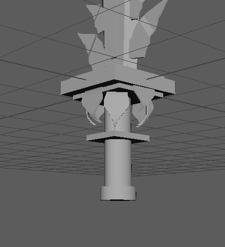
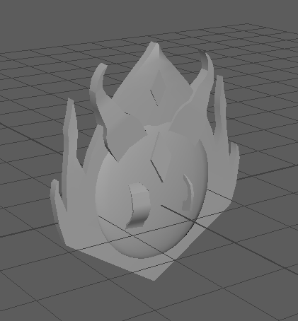
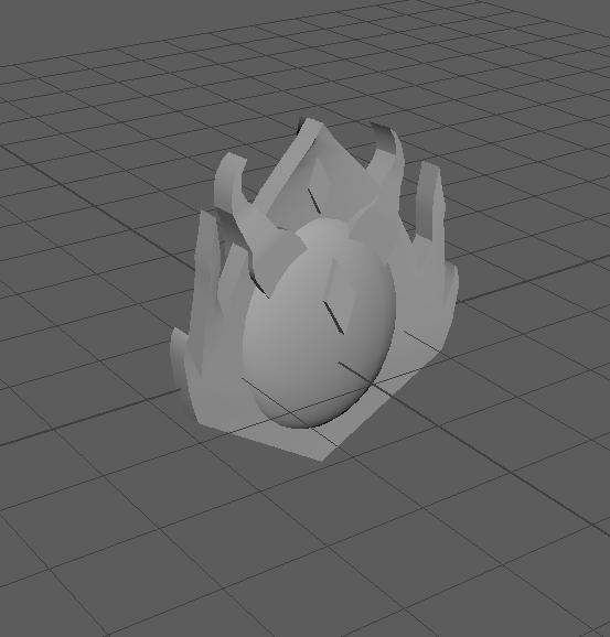
Started by modelling the sword. As expected, had difficulty making the blades in the center and found that it was a better idea to have the larger shapes towards the bottom so the sword wouldn’t be heavier at the top making it harder to carry. It would be for a stronger or larger character so I extended the length of the hilt.

Sword model 1Sword model 2

Realized the decoration on the hilt hanging over the edges could make it difficult to hold so I added a division between the end of the sword and these decorations and later extended the hilt length more so there was more room on it for a hand.

hilt 1

Shield was made less intricate but based on the design of the sword and added further decoration as it went on. Initially based it on the earlier sketch but found that the model looked boring in comparison to the sword. Added more curling decoration and diamond shapes to link it to the sword design. Hoping to add jewel decorations to the sword and shield in the UV unwrapping and texturing stage.

Shield model 1

Shield model 2

Peer review: The shield was too thin to be functional so using object mode, made the whole model thicker

shield 3

Sword UV map

Found some shortcuts and places to stitch together to simplify the UV map. The cubes were out of proportion so simply used ‘automatic’ button to map them out and stitched incomplete edges together.

UV unwrapped most of the shield part by part but selected the whole model later and realized they were overlapping each other. Need to make the UV map neater and separate overlapping parts. Found out there were hidden faces in vertex face mode interfering with planar mapping. Used the merge tool on the whole model and kept the default value. This fixed the issue.

Shield UV map complete

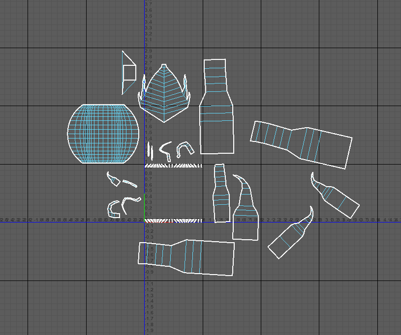
Completed shield UV unwrapping. The faces on top of the sphere shape may be difficult to select to texture but the colouring there probably won’t be too complex.

Started working on sword and shield texturing. Added some free metal textured and used the mixer brush to make the texture look less detailed relative to the rest of the sword so far. The blade of the sword is blue and I added light soft brush/dodge tool to make it look shiny and metallic. For each of the smaller parts of the sword (protrusions from the blade, smaller parts on the hilt) I tried to do the same thing and make them look metallic using shading. Shading needs improvement and it doesn’t look realistically metallic but it looks more like 3 dimensional shading than the ship has.

Learned to save and load selections to save time if I deselect by accident. Saves a lot of time and makes some parts of the process faster.

Sword UV Screenshot textured sn.PNG


This sword I found in Sketchfab has the same use of gradients I want to replicate with my sword and shield. The sword has seamless looking highlights and shadows added in the texturing stage and each part of the sword looks like it matches the others. The seamless look is something I’m having trouble replicating in my own model, possibly because the sword and shield wasn’t created with texturing in mind. In future, if the model is planned in advance with an idea of where light and shadow will appear on each part of the  result, it could be easier to texture later on. The shinier parts of the model have whiter highlights to show that it is reflecting more light and more matte parts of the sword or duller metal has less obvious highlights and they appear softer. Lots of the models in Sketchfab have cracks and dirt on the model to make them more interesting and according to the model inspector, this is all added in the texturing stage so I could try some of these techniques.

Sword UV Screenshot.png

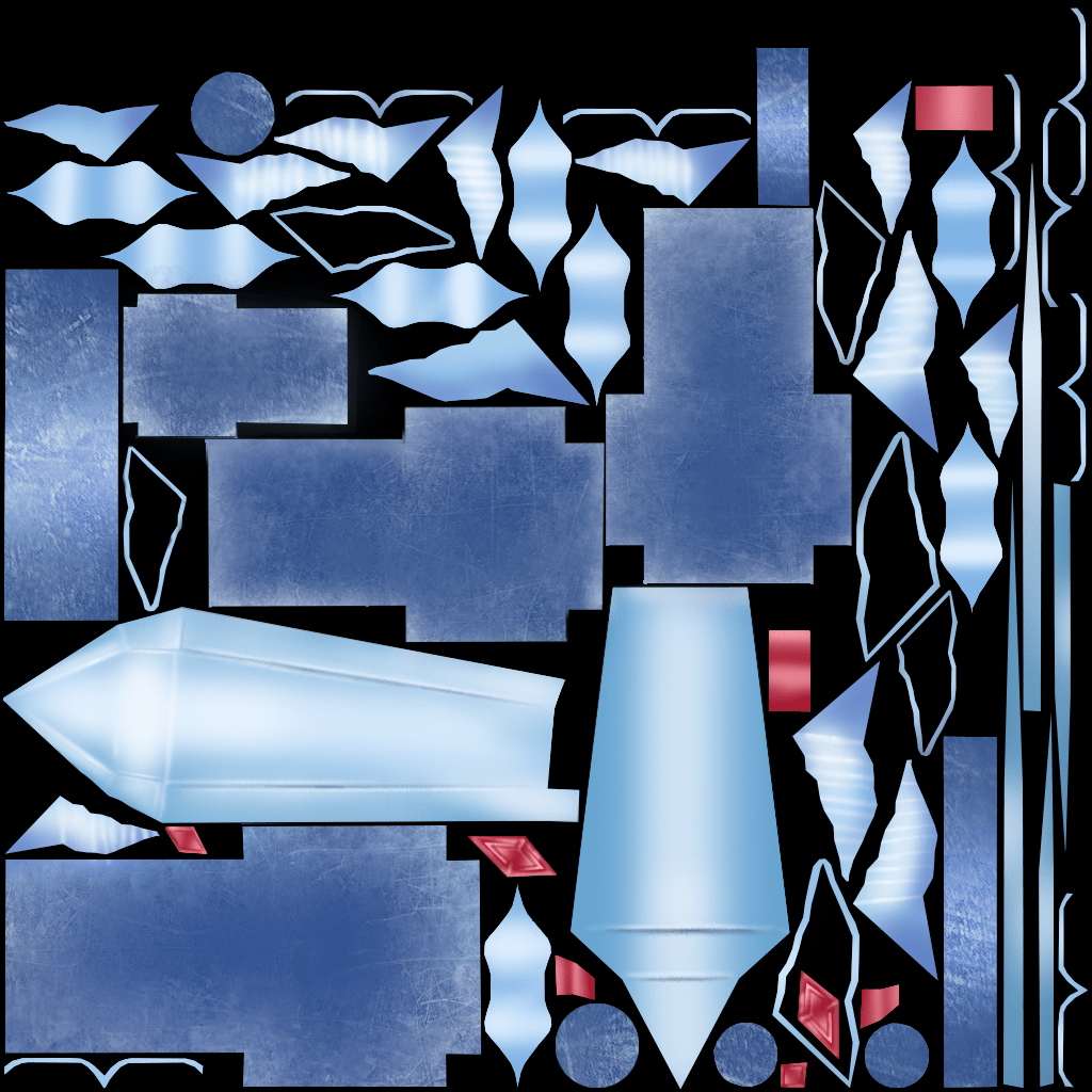
Tried to implement these ideas by painting the appearance of sharp edges or something ingrained in the surface, specifically on the blade. Some highlights and shadows on the leaf-life metal decoration on the side of the blade and on the hilt to make them look more textured and 3D

Sword textured

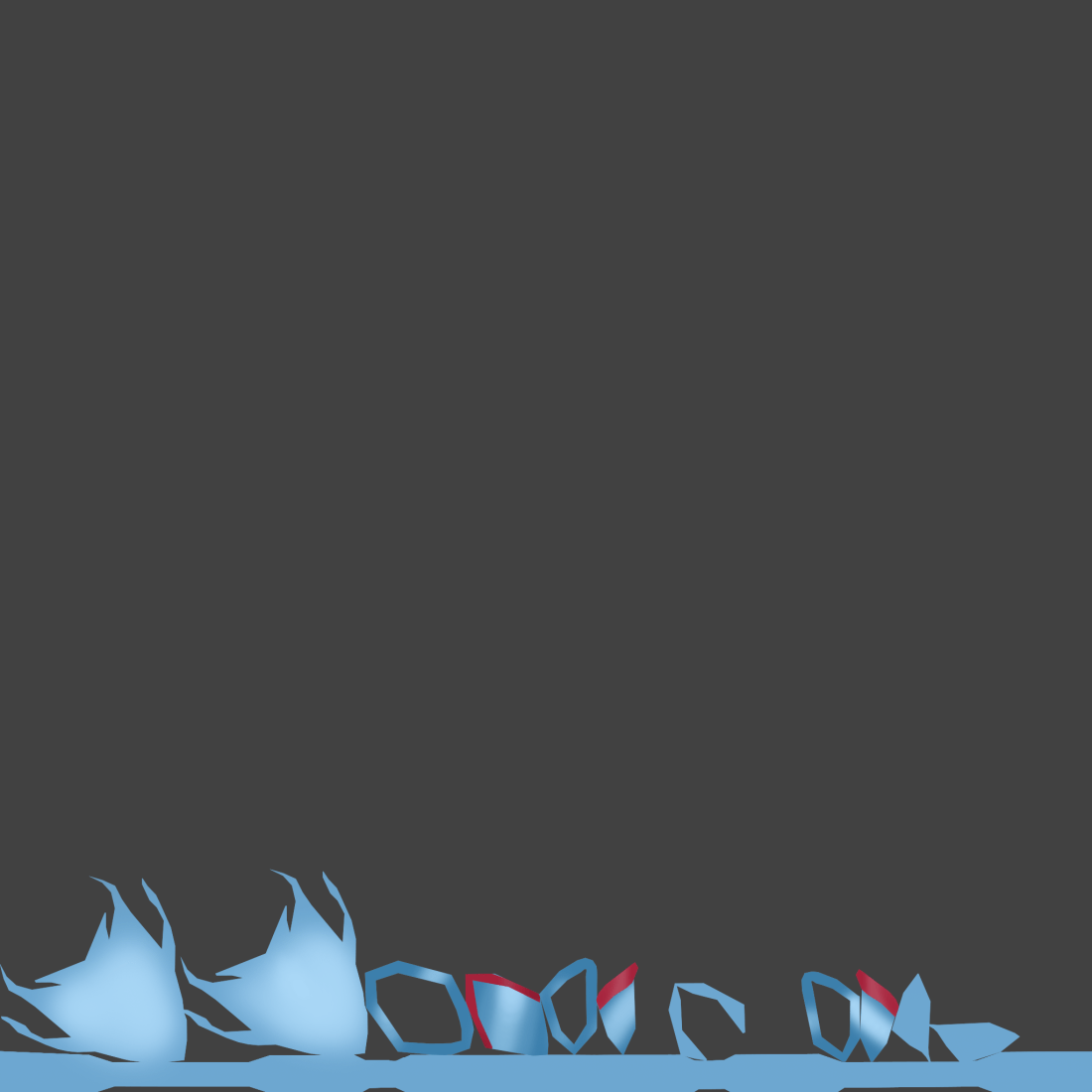
After a number of technical problems with the first shield I designed making it extremely difficult to work any further on, I made another one.

The shield was created after the sword with the same colour scheme and shapes in mind so they look like they are meant to be presented together. The shield has less embellishments compared to the sword but I like the horn like shapes framing the shape. I started the model with a typical shield shape and added them to make it more interesting when I realized it looked boring compared to the sword.

Shield Body UV Screenshot.pngShield screenshot

https://skfb.ly/6E6O6


Sword:

https://skfb.ly/6Kxn7

Sword screenshot


Ball, Pendulum, Lamp Animation

First attempt:

Started learning the fundamentals of animation and tried animating a pre-made pendulum model. Learned how to set up the work space and navigate the animation options such as moving through the timeline, adding new keyframes, making the animation faster and slower by manipulating the timeline.

Started learning to animate by looking at the 12 principles of animation, focusing mainly on the ones applicable to the project such as slow in and slow out, overlapping action, arcs,  timing and attempting to apply them to the animation by adding frames in the appropriate places and positioning the pendulum in good positions. This was supposed to create the illusion of physics affecting the pendulum

I think my attempt could have been better. It doesn’t move naturally and some time was used up focusing on a previous attempt. Unsure of the way the end of the pendulum should drag behind because of the weight. Other than that, I have improved with using Maya to animate.

Final attempt:

I animated the pendulum rig by creating a keyframe at the start middle and end and noticed that it straightens out in the middle of the animation because of the weight of the pendulum. Added a slow in/slow out movement because it looked robotic without it. By the time it gets to the opposite swing I decided not make it look like it was curling round because there wasn’t enough momentum and it appeared unrealistic.

Happy with the general movement of the lamp. I included a slow anticipation of the jump, fast movement up, landing and bouncing up as an overlapping action. The overall animation is slightly fast

Overall the ball bouncing looks okay but it shouldn’t stretch as it falls. It should only realistically stretch as it bounces off the ground which squashes it. In the Graph editor I could manually change the momentum and arcs of the ball without editing individual keyframes which made the process easier.


Design presentation: model sheets

04af5ff4a4b9d29bc73e1754e51cdacd

The first couple of pictures stand out on this page first because of the colours on the finished sketch. They stand out against the other sketches with no shading or colour that serve the purpose of explaining the design technically. There is a more detailed sketch of the interior in the lower right corner possibly so the person modelling the design can take the interior into account when making the exterior.

The design also catches my attention because it is based on a police car, something familiar, but with a futuristic twist to keep it interesting.

4 ways in which presentation techniques were used:

  1. Placing the most eye catching images/detailed images further apart so the page doesn’t look cluttered and the eyes are lead to the outline sketches as well as detailed pictures
  2. The page is very comprehensive and easy to understand possibly to make it easy for the person modelling the vehicle to refer to it when working.
  3. The outline sketches are set up neatly, taking up enough space without looking like there is too much to look at and overwhelming the person looking at them
  4. The colourless outline sketches are the same size as other outline sketches and colour sketches are the same size as each other, creating a clear line between them and showing that they serve different purposes.