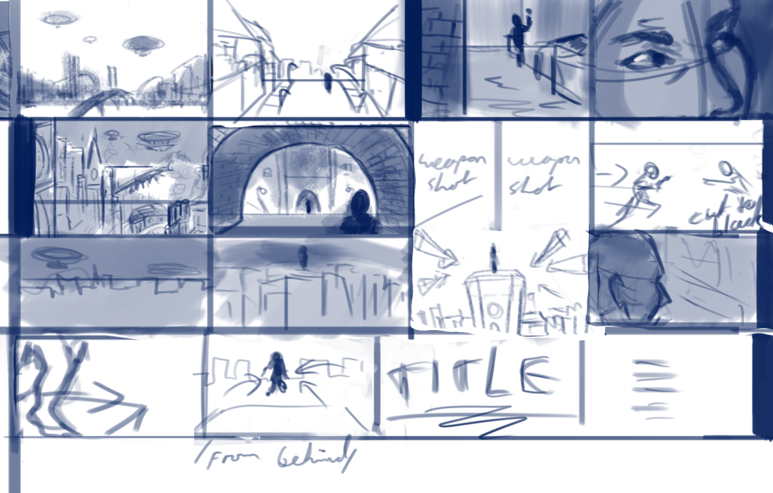
Agile project management

Agile

Agile is a method of working in a group that groups categories into what should be a priority compared to what shouldn’t.

Agile groups focus more on being flexible within the team and changing plans based on what works for the individual members.

Agile generally prefers shorter time frames and works around motivated individuals to get work done fast and efficiently.

It depends on flexibility in the fast paced system, quickly working out what works and what doesn’t and adjusting accordingly.

It doesn’t rely on creating a detailed plan and sticking to it because of the limiting effect that has.

Encourages diversity of ideas and lots of communication within teams to ensure the best way of working.

Agile produces work faster than traditional waterfall project management, meaning the focus is more on quantity than quality but the team can receive feedback from a client on quickly produced and easily changeable products, rather than changing the entire plan if a client doesn’t like it.

Agile focuses more on consistent evaluation and optimization within each step compared to waterfall project management

Waterfall project management

Image result for waterfall project management

Agile project management

Image result for agile project management


Scrum

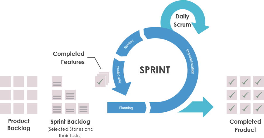
Scrum is a tool used in agile project management to produce work. Sprints are used to separate the project into sections to complete. Sprints involve a short planning stage, followed by implementation, within which is a ‘daily scrum’ or ‘daily stand-up meeting’ to alter the product based on the clients and team members preferences, When the implementation is complete, there is a review of the produced work. Anything that is not satisfactory is included in the next sprint and the first sprint is complete.

As shown below, the planning phase consists of the product backlog and the sprint backlog, first detailing the most important aspects of the product that need to be created, anything the team is unsure about can be added in future sprints when the product is more fully developed. The sprint backlog is presumably created in order of most to least important features and completed according to that.

Image result for daily scrum

Reflection

It’s important to regularly update the plan or outline for the project so if anything has proven to be ineffective, unimportant, or more important than expected, the project management documentation has to be updated to work around peoples ideas and changing opinions. If the plan isn’t changed, people may continue working on something that is no longer necessary and neglect a new priority that came up during implementation.

The group can tell if they are on track for a deadline by setting smaller deadlines within the larger project. It allows for more flexibility. Deadlines can be set for each individual feature and if they are not complete, it’s a sign they are falling behind. If the team falls behind, they can make a note of everything they still need to do and adjust the plan/sprints to fit within the remaining time until the deadline.

Imagined Worlds

2 Hour Team Project

Decided to create a spinning globe with a fairground scene on it with a team of 3 people. I did some sketches of what I thought it could look like and some sketches on Photoshop to see what colours look good. Other team members did the lighting, 3D modeling and setting up the scene. Since most of my work was in pre-production, I helped with some 3D modeling for the carousel, teacups and horses for the carousel when I ran out of things to design. Ran out of time before putting them in the scene. The product at the end was a simply textured globe, a food stand, a Ferris wheel, and some lights.

carousel1horse1teacup1

The lighting and navigation of the scene looked good and displayed everything we worked on. The Ferris wheel model looked good, and the lighting improved the scene.

Time management overall was okay but I spent too much time on small assets and sketches before helping with modeling. It surprised me how quickly the team set up a coherent scene. Something I need to work on in the future is working faster, finding shortcuts to simple problems, and spending less time on unimportant things. Overlooked placing some models into the scene at the last minute.

Imagined Worlds moodboard/pitch

Prompt for the imagined worlds project: Metal and Glass

Created two quick moodboards, one for glass, one for metalMoodboard pitch

Idea for the glass moodboard was an aquatic theme based on glass tanks or screens. Wanted to incorporate stained glass windows because of the visual appeal and colour. Came up with a vague idea of a cult based in a church, worshiping something sinister behind glassMoodboard pitch 2

Wanted to do something related to liquid metal. Another vague idea of a vfx, matte painting or illustration depicting humans/androids inhabiting a planet made of liquid metal

Decided on a horror/steampunk trailer

  1. Digital but can do traditional if needed
  2. Using Photoshop mostly, can also use Maya and Sculptris if needed
  3. Need a graphics tablet but less detailed parts/blocking out may not require one.


Moodboards


Steampunk moodboard 1.PNG

Steampunk moodboard MilesSteampunk moodboard Miles vehiclesSteampunk moodboard Miles charactersSteampunk moodboard KieronSteampunk moodboard JakeSteampunk moodboard Jake characters

Created mood boards to show what everyone’s ideas are when doing the concept art, character design, asset design, and environment design.

Technical specification

Technical Specification Update

Asset list

https://trello.com/b/ZfdE5Lb4/imagined-world

The assets are included within the tasks to be completed in trello.

Trello screenshot.PNG

Burndown chart

Burndown Chart

Production schedule

Production Schedule

Sketches


Shot list

Shot list

Storyboard

Created some of the storyboard, considering the angles that might be appealing and how to follow the pace of the trailer. To start with, the angles are simple and decorative, showcasing the eventual town, and the houses, vehicles and assets within it. The protagonist is shown walking through town, through an archway or bridge for vehicles, with something dark in the foreground to show depth, make the scene more interesting and add some atmosphere. Half way through, the antagonist will be hinted at, by having a shot including her silhouette or only a partial amount of visual information about her. When the trailer picks up pace, there will be a full shot of her by zooming in from a far shot of a tower she is standing on and some insert shots including a confrontation between the two characters happening under a bridge. Some shots are yet to be sketched out as shown below.

Storyboard (WIP) screenshot.PNG

Complete version

Storyboard screenshot

Completed the storyboard and simplified the panels, focusing more on adhering to the shot list or adding changes such as a weapon shot before the conflict rather than a face shot, and a different perspective in the face off that adds more depth. The simplicity of some of the panels makes them hard to decipher so I added some storyboard notes for the rest of the team to read. Started from scratch, adding in panels from the previous attempt in a more appropriate order.

Storyboard notes

Panel

1: Simple shot of the city from a distance

2:Character walking through Victorian street lit by street lamps. Looks dilapidated compared to towers/bridges/landmarks.

3. Character in alleyway, hiding behind a corner looking out

4. Close up of characters eyes looking around for danger

5. More busy shot of the inner city

6. Hip shot or shoulder shot of main character looking at the antagonist at the other end of the tunnel, could also be side by side

7. Shot of characters drawing weapons could be more interesting than a close up of their faces.

8: characters run at each other and the screen cuts to black before they collide

9, 10, 11: Slow panning to the antagonist against the skyline on a tall building

12:Antagonist looking out, presumably at main character

13: close up of feet running off the edge of the building

14: Shot of character jumping from behind

/title and credits/

Recently the team decided against a steampunk theme. Steampunk isn’t an integral part of the storyboard and plan so far, aside from the asset list and moodboards, so starting now, the concept art will be a modern city theme and I will create some more moodboards with the updated plan.

Block out


Research images


Style guide


Audio plan

Audio plan.PNG

Concept art


Scrum


Case Study

Playing Hard Report

The documentary Playing Hard focuses on the process of making and selling the game For Honor, code named ‘Hero’ during development. At the time of the documentary being made, the games industry was predicted to be worth 100 millions dollars by 2017. It is told from the perspective of the man who created it and the emotional toll the development and release of the game took on him.

The first step of the process involved pitching to companies until they decided to fund the game. He was rejected several times before being accepted by Ubisoft and part of the reason behind this is that sequels to successful games are much easier to produce than new ideas. It was pitched and funded at increasing stages of development. The team behind the game grew larger and it became harder to manage as an individual, so more people were delegated responsibility until the man behind the game had much less influence on its creation.

Eventually the game was tested and critiqued by players so the developers could know what people liked and disliked about the unfinished product. There was news nearing the end of the development that the split screen function had been removed despite the creator saying it was necessary and it received some criticism.


Emerging Technologies

Emerging tech notes/ ideas

History, present and future of:

Graphics tablets/Artistic software (both?)

Telautograph (1888)

Image result for Telautograph

Similar concept to drawing/graphics tablets but used for communication. Worked like a _____ but the machine detected pen movement, transmitted the movement into electrical signals, and recreated the movement on the other end similar to the concept of a drawing being recreated on a computer screen from a tablet.

Stylator (1957)


Used for handwriting recognition

RAND tablet (1964)

https://tedium.co/2017/09/21/wacom-tablet-history/

Summagraphic Bit Pad

Apple utopia graphics system (1979)

Rebranded Summagraphic Bit Pad, called a “digitizer” (graphics tablet). Sold by other manufacturers

Scan of Document: Summagraphics Bit Pad One

The first Apple Tablet… from 1979

Worked in collaboration with Summagraphics 

Came with a stylus because mouses weren’t popularized until 1984 with the original Macintosh

Described by apple:

” The Apple Graphics Tablet turns your Apple II system into an artist’s canvas. The tablet offers an exciting medium with easy to use tools and techniques for creating and displaying pictured/pixelated?? information. When used with the Utopia Graphics Tablet System, the number of creative alternatives available to you multiplies before your eyes. “

At the time, it ran on the Apple II plus

Image result for Apple II plus

Discontinued when FCC discovered it interfered with radio frequency

Koalapad (1983)/Koalapainter

Koala Technologies KoalaPad TouchTablet

KoalaPad TouchTablet - box (front)

Painted one pixel at a time and could draw simple shapes. Could be used with fingers as a touch screen, which the Apple graphics tablet (rereleased after radio disruption was fixed) could not.

Wacom patent drawing

Patent drawing of Wacom technology.

Microsoft Tablet PC (2001), Produced by Lenovo. Not successful, Hybrid of a touch screen tablet/ graphics tablet.

Image result for microsoft tablet pc 2001

Image result for Wacom Graphire 3


Storyboard

pastedImage


  1. Establishes character
  2. Shows character trying to fly in frustration
  3. Character notices balloon
  4. Character uses the balloon to get up high
  5. The balloon pops and the character falls onto a branch
  6. The character dives from the branch into a pool and floats by as the animation ends

The storyboard is slightly too complicated for a short animation but I like the character I designed and the lack of facial expression makes it look clueless and unintelligent, which works for the series of events that happens. I could make the eyes wider for scenes like the balloon popping and the bird falling.

Concept art/Environment design

Concept art and environment design is a part of game design I am most interested in pursuing. In lessons we learned about photobashing images and integrating them into concept art to make some areas look seamlessly realistic. We also learned to come up with ideas by heavily editing images, zooming in, warping things then coming up with the colours and composition that way.

I have environment art from over the last year at various stages of skill level and they are ordered newest to oldest.

This one (the most recent) I think has the best attempt at light and shadow where some of the others shown are older and I was less aware of where they might be placed.

Riverside

This one was used mostly to practice photobashing which still needs work before it looks realistic but I like the rocky area and shore on the middle/right side of the canvas lit by the sun as it looks like the most seamless area in the picture

Seashore landscape.png

Learned how to use custom or pre-made concept art brushes in photoshop to make things like clouds or the white birds above the mountain easier to paint. Overall happier with this one than the last one because it looks like more time was spent on adding and preserving the details from the photos in it.

girl with red coat in mountains

Used some photos I took of some clouds as a reference for the colour scheme and blended them into the background. I used photoshop brushes to blend into the picture where the lamp posts or trees started to appear and painted the rocks from scratch as the attempt at using photos on those didn’t look the way I wanted them to. For the castle, I made the silhouette of it, made a custom brush from a photo of a castle, clipped it to the silhouette on a new layer and painted over it with the lighting from the sun behind it and some extra details to make it blend in

floating landscape 1.png

Photos used:

41530588_246793922684919_8128124096127959040_n.jpg41530588_246793922684919_8128124096127959040_n.jpg

Painted this without the use of photos but still used brushes where it would have taken too long to paint in all of the leaves or grass.

forest tn1.png

This is one of the earliest attempts at environment art I’ve done and at the time I was happy with the light and shadow on the rocks that made them look semi realistic. I like the fog in the background although there was probably too much used to compensate for the lack of detail but I think it still adds to the atmosphere.

landscape thing.jpg


Sculptris

Tried using Sculptris to expand the range of software I can use on any 3D projects. Started with a symmetrical blob of material and after experimenting for a while, made this:

Head modelling 1 front view

Although the face was exaggerated it looked like an alien so I added some alien features and deepened or exaggerated the existing features. There are some creases around areas where that were sculpted and edited a lot, such as around the eyes but since they took a lot of editing to look right, I think this is inevitable at this stage.

Head modelling 2 front view.PNG

Overall I’m very happy with the result, it is easier to navigate and create in than Maya, unity and mudbox in my opinion and with the option of symmetry it is easier to make something that looks good. I think it would be good for creating more complicated looking characters but maybe another software, such as Maya, would be more efficient for creating simple characters.

Watermelon animation analysis

Animation Analysis

12 Principles of animation & where they are demonstrated

Squash and stretch: Most instances where this would be used is replaced with blurring the character to indicate fast movement rather than stretching the model. It is used when he is pulling on the vines in the bathroom mirror and is slightly clearer when his body becomes circular. Overall the squash and stretch in’t extremely exaggerated.

Anticipation: Is used when he is about to run out the door. He pulls back to show the viewer he’s about to run fast. It’s also used as he is about to roll into a ball in the race.

Staging: 

Slow in/slow out: is used throughout the animation to make the movement look realistic. It is shown clearly when the main character is moving to reach and take a bite of watermelon. This is presumably used to make the moment significant by exaggerating it.

Appeal: Is used in body language, movement and facial expressions. The movements the boy makes are playful, curious and sometimes clumsy (for example,when he runs out of the school and down the street) to make him appear childlike to match his character design.

Exaggeration: The whole concept

secondary action: person playing in foreground while watermelon falls from sky

straight ahead: watermelon juice coming out of his nose

overlapping action: moments after the melon boy is running or moving fast


Short animation character design

Character is designed and modeled. Decided on a small, clumsy looking bird with eyes on either side of the head, a small, round frame with small wings and a tail.

modelled bird character

modelled bird character front

Learned how to crease edges when smoothing a model so the selected edges stay sharp and the rest of the model is smooth. The creased edges are displayed as thicker edges on the mesh

modelled bird character mesh

I still need to finish unwrapping the model and texturing it, probably using gradients to save time, and rigging the model before animating it.

bird gradient grid screenshotbird screenshot

Used gradient panels of colour and applied them to the model using hypershade in Maya. Although it’s simple I think it saves time and goes with the simple style of the character.

I created joints, mirrored them across the character and bound the joints to the skin. Started painting skin weights to fix distortion that occurs moving the joints

Bird skin weight wing

The red area on the model is the colour ramp displaying the affected area. Everything black displayed is unaffected. This makes it possible to move the wings/legs even if it is a part of the model without distorting the rest of the body.

Bird wing lifted