Concept art and environment design is a part of game design I am most interested in pursuing. In lessons we learned about photobashing images and integrating them into concept art to make some areas look seamlessly realistic. We also learned to come up with ideas by heavily editing images, zooming in, warping things then coming up with the colours and composition that way.
I have environment art from over the last year at various stages of skill level and they are ordered newest to oldest.
This one (the most recent) I think has the best attempt at light and shadow where some of the others shown are older and I was less aware of where they might be placed.

This one was used mostly to practice photobashing which still needs work before it looks realistic but I like the rocky area and shore on the middle/right side of the canvas lit by the sun as it looks like the most seamless area in the picture

Learned how to use custom or pre-made concept art brushes in photoshop to make things like clouds or the white birds above the mountain easier to paint. Overall happier with this one than the last one because it looks like more time was spent on adding and preserving the details from the photos in it.

Used some photos I took of some clouds as a reference for the colour scheme and blended them into the background. I used photoshop brushes to blend into the picture where the lamp posts or trees started to appear and painted the rocks from scratch as the attempt at using photos on those didn’t look the way I wanted them to. For the castle, I made the silhouette of it, made a custom brush from a photo of a castle, clipped it to the silhouette on a new layer and painted over it with the lighting from the sun behind it and some extra details to make it blend in

Photos used:


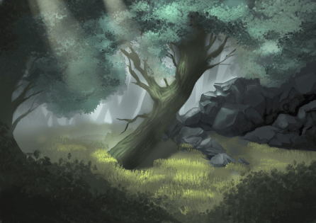
Painted this without the use of photos but still used brushes where it would have taken too long to paint in all of the leaves or grass.
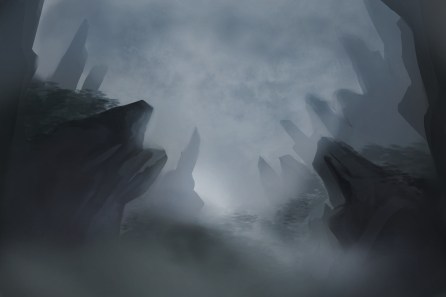
This is one of the earliest attempts at environment art I’ve done and at the time I was happy with the light and shadow on the rocks that made them look semi realistic. I like the fog in the background although there was probably too much used to compensate for the lack of detail but I think it still adds to the atmosphere.