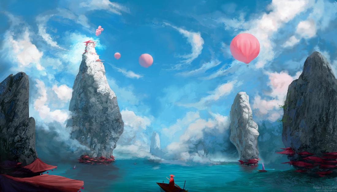
The first thing I noticed was the pink balloon on the right side of the image. This is because of the size of it and because it contrasts against the blue sky. It doesn’t look out of place because of the other pink tones throughout the image (such as other balloons, the red objects at the base of the rocks, and the pink shifted clouds) The colours are darker round the bottom edges and corners of the pictures, drawing more attention to the light area at the top of the rock with the building on it. The colour scheme is analogous because the colours shift from blue to purple to pink to pinkish-red throughout the picture. The bottom third of the image is red and green complimentary colours, maybe to draw attention to the figure at the bottom of the picture on the pier/boat.
